It’s that time of year again—the time when I post to my blog! Otherwise known as Lunar New Year. You may recall that last year was a Metal Rat year (sounds so bitchin’!), so this is the Year of the Metal Ox! It’s time to straighten up and fly right, apparently, with the ox being the year of careful, slow, heavy building towards success.
I started sending out my postcard a couple of weeks ago, but I have a lot of them, so if you want one please send me your address! When my little cousin got hers, she asked me how I did it. Honestly, it’s what I’m always wondering too! So I broke it down and here are my steps:
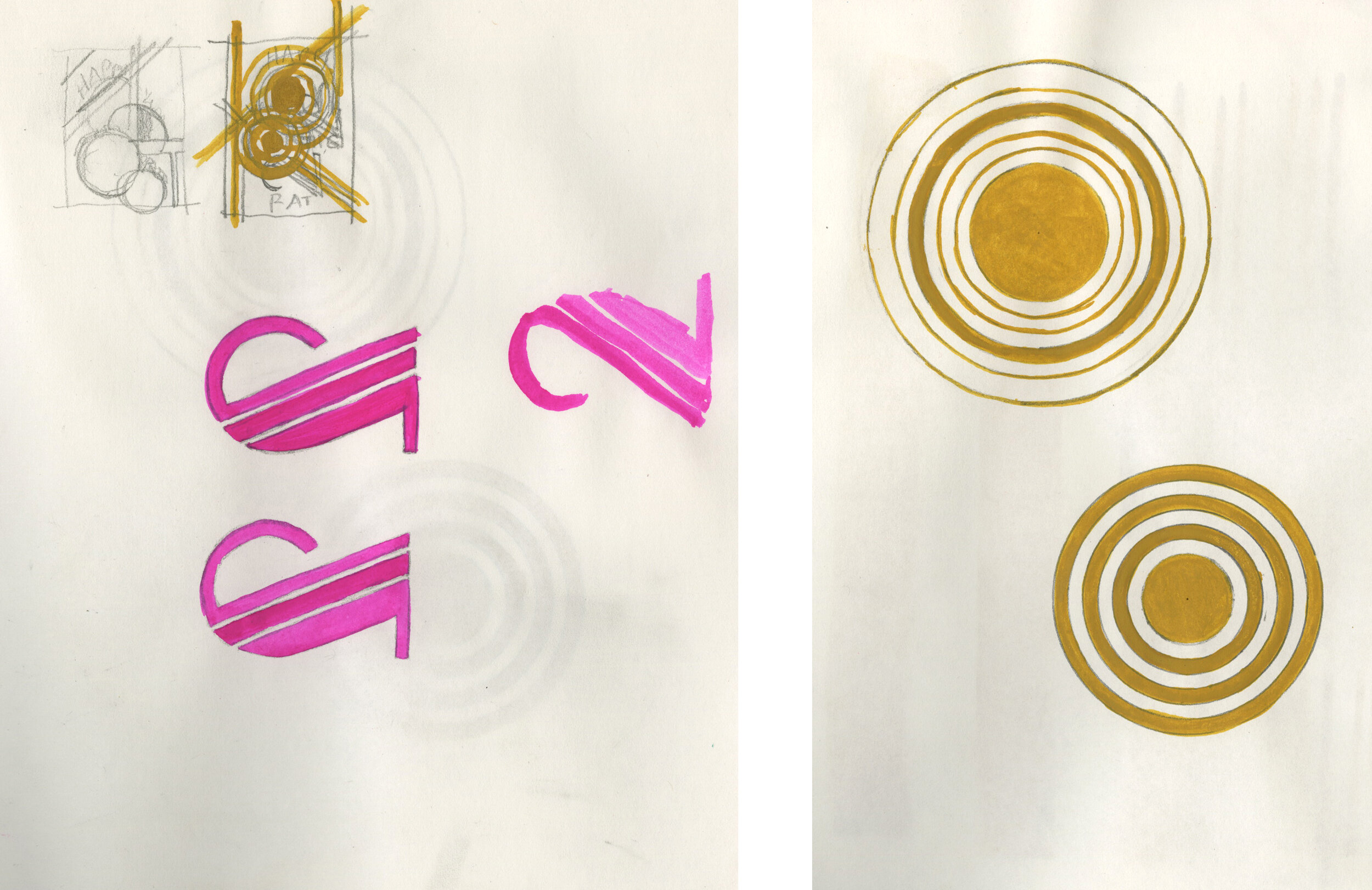
Research oxen and symbols and colors and anything else that comes to mind.
Make some thumbnails for designs.
Start drawing, and then hate your drawings, so make more drawings.
Eventually, decide that they’re not terrible. Pick the least terrible one that will work with the design.
Find it doesn’t work and give up halfway through and have a snack.
Go back and see that maybe it will work after all. With a lot of futzing.
Do the futzing but try not to futz too much.
Call a friend for their opinion and make them look at a bunch of different variations.
Ignore your friend’s opinion (although this time I listened to his opinion because it agreed with mine lol) and finish the one you like.
Send it away to print.
Get it and love it!
Look at it a half hour later and hate it.
Decide you have to send it anyway because it’s what you’ve got printed.
See, making art is so fun!! Of course, it’s not always like this for me, and apparently for some people, it’s never like this (insert intense side eye here!). But I’ve come to accept my process. Even when I hate the things I’ve made, I know I will feel differently in half an hour and in the end, it will do what it needs to do.
I thought I would also share the contenders. I’m far enough away now that I don’t hate them anymore, but I’m sure if I had any of them printed, they would be equally loathsome to me! Welcome to my world!

This was when I was trying to wrap my head around the ox’s anatomy. Trying and failing! How do the horns connect? Who knows?! I eventually figured it out, but this is a drawing I don’t hate anymore, even though it is anatomically incorrect. I mean, we don’t hate Ken, do we?
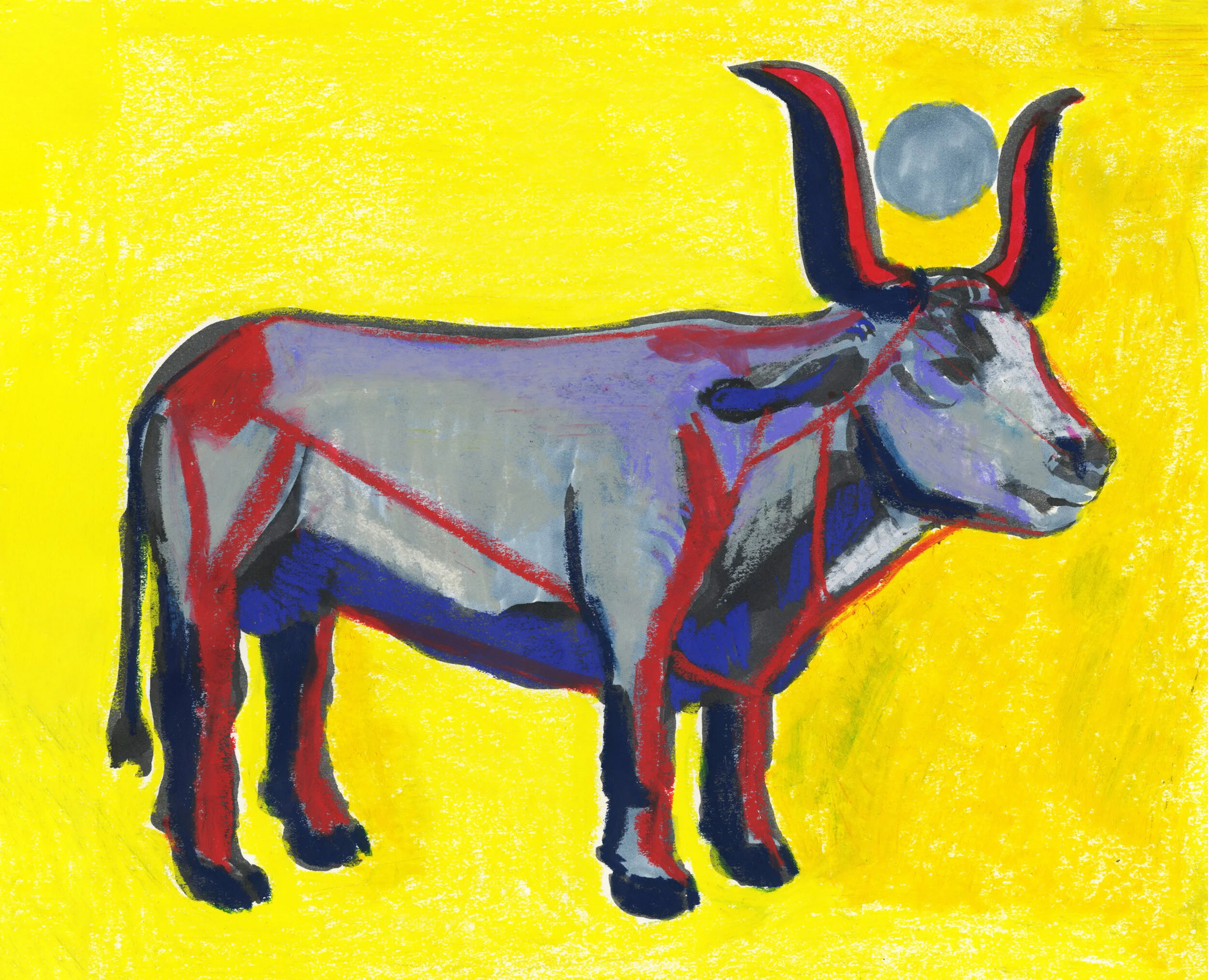
By the time I got here, I had a more ox-like ox. But once I did this more literal ox, it really bored me! Of course, I don’t think anyone can draw a bull (or an ox in this case) without thinking of Picasso, or at least I can’t. I love his lithographic series exploring just how little information you need to convey the idea of an bull. I didn’t look at it because I didn’t want to copy it, but it lives in my head, so I knew it would come out if I was thinking about what was essential for me. I had done some reading on the ox: obviously he’s an enormous beast of burden which symbolically you might think of as “male,” but his role as an animal that is put into service so all his strength benefits others gives him a “female” aspect. This and the fact the they are often castrated! In Egypt, the bull is associated with the sun and depicted with a golden disk between its horns. But I thought since we are celebrating a lunar new year, and given the ox’s female association, I would make it a moon. Sorry, Hathor!

Once I started playing with these drawings in the design I made, the design also seemed very boring. Words on top, Ox on the bottom, yawn! It all seemed so expected. I liked the moon and I thought it would be pretty to have it printed with a silver foil detail. But still boring! What about that moon, I thought? Wouldn’t it be pulling on everything? I mean, it moves ALL THE WATER IN THE OCEAN! So I thought it would make sense if the moon were pulling the words towards it, and it would break up the very static design.

Imagine that moon is shiny foil, or send me your address and see for yourself!