A Separation

A couple of months ago I read Katie Kitamura’s novel A Separation. I was impressed with Kitamura’s writing, and the way she wove her themes of absence and death, searching and frustration. I liked it so much, I decided to try to make a book cover for it.

Kitamura’s story is told by a female narrator, who is detached and opaque throughout. She and her husband have separated, although they’ve largely kept that fact to themselves. Her mother-in-law, unaware of their separation, asks the narrator to travel to Greece to locate her now-missing husband. She does so and finds a smoking, ruined landscape, destroyed by a fire a few months previous. Her husband is a ghostly presence, seemingly just out of reach. She always just misses him. I won’t say anything more (spoilers!), but I was intrigued by the images Kitamura described, of the blue, blue waters and the black, still-smoking hills, and of the husband’s ghostly presence.

The first one I did focused on Kitamura’s unforgettable Grecian landscape.

cover_1.jpg

But that didn’t seem quite right. While it got the setting, I couldn’t get a sense of the dislocation and distance of the narrator: her strange, clinical detachment. I wanted a little…more. So I made one of the narrator. Kitamura made her a frustrating one, telling a story and then negating or qualifying in the next paragraph. She withholds, and is always turning away from other characters as well as her own feelings. I thought if she were on the cover, it should show her back, turned away, or even walking away, anything to avoid a confrontation.

cover_4.jpg

But once I’d done that, I missed that sense of place, that ruined, smoky landscape. So I brought it back in combination with that frustrating narrator. I decided to focus on that ghostly husband. But once I’d done that, I was annoyed. Here was a story told by a woman, why was I erasing her to feature a man’s silhouette on the cover? She was, in her way, almost as absent as the husband. In the end, I think I like them as a set: equally missing from their own story.

his_n_hers.jpg

Have you read the book? What do you think would make a good cover?

Romeo and Juliet

I enjoyed working on my last Shakespeare book cover so much, I decided to keep on with another cover idea that I've been kicking around for a long time, but never completed: Romeo and Juliet.

I saw the play again this past summer in the park with my friend and fellow illustrator, Julia Sverchuk. She is a big supporter of the New York Classical Theatre, and always does a beautiful job drawing their performances on location. They put on the play outside in the park with characteristic verve. What struck me about the play was for all Romeo and Juliet talked about love, they BARELY KNEW EACH OTHER! And when I came home rolling my eyes about hormonal teenagers, Greg reminded me that it didn't matter. They were fated to fall in love, and fated to die (I hope I'm not spoiling it for you guys).

And when I read back into one of my medieval art books that in the setting of the play, I found that in 14th century Verona (and even in 16th century England, when it was written), the prevailing belief was that your destiny really was written in the stars (hence "star-crossed"). Nothing happened that wasn't fated already. So that's why Romeo and Juliet are tiny, tiny figures in my book cover, whose lives are lived out under the spinning, cosmic arbiters of their fates. They're also small to bring home how their lives are determined by the enmity of their families, who have divided Verona into two factions, and can only see in a limited palette of black and white. If Romeo and Juliet is not as much about the power of romantic love as much as fate, I think Shakespeare is making a case for civic unity as the foundation of any personal joy. The fomenters of disunity endanger their own loved ones in their feud, as the Capulets and Montagues learn to their heartbreak. 

Tiny, tiny pawns of fate.

Thinking about the type, I found this beautiful book of prints from woodcuts and engraved plates first published in 1601 in Nuremberg by Paul Franck. There are several alphabets in the book, each more swirly and mind-blowing than the last!

Look at this crazy, swirly type!

Look at this crazy, swirly type!

Their whorls and swirls reminded me of the witty wordplay (and perhaps swordplay) of Mercutio and even Romeo himself. I thought I could take these elaborate letterforms and soften them for a more hand drawn (and romantic) feeling, while keeping a (loose) reference to the Renaissance timeframe of the play's creation. The type allowed me to introduce some of that romance back into the cover since I suppose, against all reason, that we will continue to think (and market) Romeo and Juliet as "romantic!"

Othello

I made this illustration a few years ago, but never managed to put it together into a book cover or poster. Sometimes it can be hard for me to marry something I've drawn with type. Maybe I'm too close to it, but I often feel the cold, vector lines of a font just don't gel with my clearly hand-drawn illustrations. When I saw that The Public Theater is putting on Othello this season at Shakespeare in the Park, I thought I would dig it up and give it another try. 

Book cover on the left, poster on the right. But you knew that already.

Book cover on the left, poster on the right. But you knew that already.

Of course, my answer was very simple: trace the font by hand so its sharp edges won't contrast against my drawn edges. Why didn't I think of that before? Since Othello takes place in Venice, and the original on which Shakespeare based his play is from the mid 1500's, I chose Mantinia for the font because it was based on the letterforms of Andrea Mantegna, an artist of the Italian Renaissance. It doesn't hurt that it's exquisite and has enough personality to hold its own with a minimalist illustration. 

For the illustration, I took the idea of a classical bust since Othello is described as noble, and is fêted for his military successes. The important change being that Othello is, of course, a Moor. By and large, most of those classical portrait busts are of white men (I can only think of a few specific portrait busts of POC) and are carved in white marble, so drawing him this way highlights his difference. I used charcoal to draw his profile to emphasize that as well. I thought a minimalist approach, with the simple profile on a white ground, would highlight it even more. When Iago schemes against Othello, he says that he will "pour this pestilence into his ear," so the ear was already a feature that I knew would be important. To imagine Iago, or perhaps his innuendo, as a snake, and then to make the snake into Othello's ear was a quick visual jump.

I learned a lot doing this—mainly to never throw out something I think I'll never finish! 

The Year of the Dog

2018 is the Year of the Dog in the Lunar Calendar, and I am so ready to turn the page on the Year of the Rooster. I was a little too exhausted and overwhelmed this past holiday season to send out holiday cards like I usually do. I just couldn't get into the holiday spirit. So I promised myself I wouldn't let the Lunar New Year go by without sending out some cards to my friends.

I started out doodling some dogs on a old throwaway piece of 18x24 paper because I thought it would make me happy to draw them kind of big, on paper I didn't care about, just for fun. I didn't really mean for it to become anything that I would send out or show anyone. If anything, I thought they would be practice dogs for a *real* piece that would come later. And then I let some of them be really silly and derpy because that's why we love them, right? They get so excited, jumping around, and they just can't hide that they love you, they love rolling in the dirt, and running fast. They love the world. I put in the words in any spaces that didn't have dogs, and decided they wouldn't be fancy script, but just straight-forward all caps. It seemed to suit the dogs I had drawn the best. I patched a few places where the ink had run or dripped, and then used up a whole marker (ha!) making them a yellow field to play in. By then, I had fallen a little in love with how silly they were, and I didn't want to draw them more accurately or "better." I felt it would take away some of their joy.

The rest of the story is Photoshop and Moo. By now, most of the people I've sent them to have received them. My friend Alex was kind enough to share on his Instagram, so you can see the finished postcard here. I still have a couple left, so if you didn't get one, leave me a comment or send me an email with your address and I'll send one to you!

People born in the Year of the Dog are supposed to have something of the dog's friendly, generous spirit, with a deep sense of right and wrong. Those traits are supposed to carry over to characterize the year, with people fighting for causes they believe in, according to one site I read.  Happy Year of the Dog, everyone! May you have health, wealth, and prosperity in 2018!


Artists for Democracy on the AOI Blog

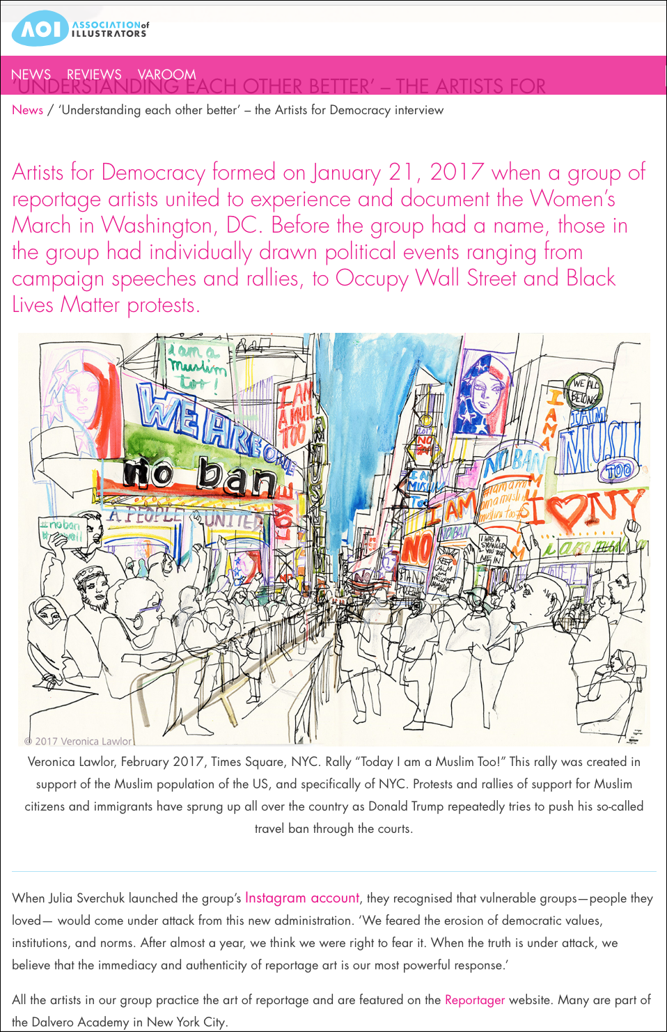
The Association of Illustrators recently featured #ArtistsforDemocracy in a blogpost entitled "Understanding Each Other Better," and it has me taking a look back on 2017. It's hard to believe it's been a year since we got on that bus to Washington DC for the first Women's March, and honestly, it's a little painful to reflect back on the year. There just doesn't seem to be a bottom to this unscrupulous, unprincipled, cruel administration.
But drawing—and specifically drawing on location—has remained a bright spot. It takes me away from the steady drip of bad news, and connects me up with the people who feel the way I do: the angry, exuberant, hopeful people. Even better, it's great to go out and draw with the amazing artists I am lucky enough to call friends. Go take a look at the Artists for Democracy instagram and you'll see what I mean. I'm looking forward to drawing at tomorrow's 2018 Women's March. If you're in New York City, maybe I'll see you there!

Screen Shot 2018-01-19 at 10.41.48 AM.png

A big thank you to the AOI for featuring us!