2022 is the year of the tiger. I won’t go too much into my process this year, mostly because it was a lot faster and less tortured. What can I say? Occasionally, things are less fraught! I think part of that was just giving myself permission to…enjoy myself. Revolutionary. So that’s what I did. I wanted a really colorful card this year, and more of a full image instead of the minimalist design that I usually choose for my cards. Since my day to day job is in graphic design, it’s easy for me to default to a more design-oriented card, but after all, I trained as an illustrator and I wanted to showcase that. I wanted a warm, tropical jungle of color and texture for my tiger as this winter has seemed extra gray. Some of you may have seen on my instagram that I’ve been experimenting with some abstract painting. I think all those color experiments have opened me further to the color I’ve always loved, but have used sparingly, or purposefully. It’s been a tough couple of years and I think whereas I always wanted a reason to use a certain color before, I’m okay now with just using a color because it feels good. Isn’t beauty reason enough on its own? Beauty and pleasure have been in short supply over here, so in 2022, I’m saying yes to both of those! Happy Year of the Tiger, everyone! I hope it brings health, wealth, and abundant peace and happiness to all.

The Year of the Ox
It’s that time of year again—the time when I post to my blog! Otherwise known as Lunar New Year. You may recall that last year was a Metal Rat year (sounds so bitchin’!), so this is the Year of the Metal Ox! It’s time to straighten up and fly right, apparently, with the ox being the year of careful, slow, heavy building towards success.
I started sending out my postcard a couple of weeks ago, but I have a lot of them, so if you want one please send me your address! When my little cousin got hers, she asked me how I did it. Honestly, it’s what I’m always wondering too! So I broke it down and here are my steps:
Research oxen and symbols and colors and anything else that comes to mind.
Make some thumbnails for designs.
Start drawing, and then hate your drawings, so make more drawings.
Eventually, decide that they’re not terrible. Pick the least terrible one that will work with the design.
Find it doesn’t work and give up halfway through and have a snack.
Go back and see that maybe it will work after all. With a lot of futzing.
Do the futzing but try not to futz too much.
Call a friend for their opinion and make them look at a bunch of different variations.
Ignore your friend’s opinion (although this time I listened to his opinion because it agreed with mine lol) and finish the one you like.
Send it away to print.
Get it and love it!
Look at it a half hour later and hate it.
Decide you have to send it anyway because it’s what you’ve got printed.
See, making art is so fun!! Of course, it’s not always like this for me, and apparently for some people, it’s never like this (insert intense side eye here!). But I’ve come to accept my process. Even when I hate the things I’ve made, I know I will feel differently in half an hour and in the end, it will do what it needs to do.
I thought I would also share the contenders. I’m far enough away now that I don’t hate them anymore, but I’m sure if I had any of them printed, they would be equally loathsome to me! Welcome to my world!

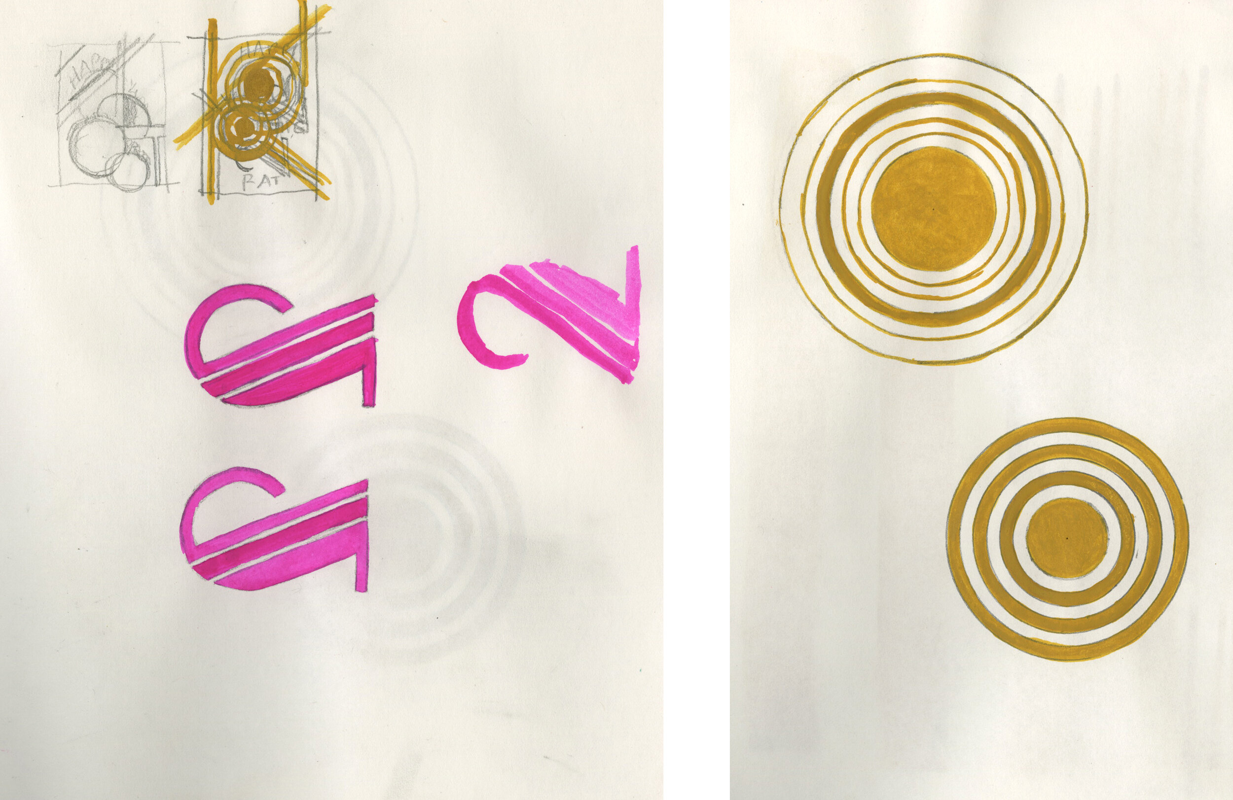
This was when I was trying to wrap my head around the ox’s anatomy. Trying and failing! How do the horns connect? Who knows?! I eventually figured it out, but this is a drawing I don’t hate anymore, even though it is anatomically incorrect. I mean, we don’t hate Ken, do we?
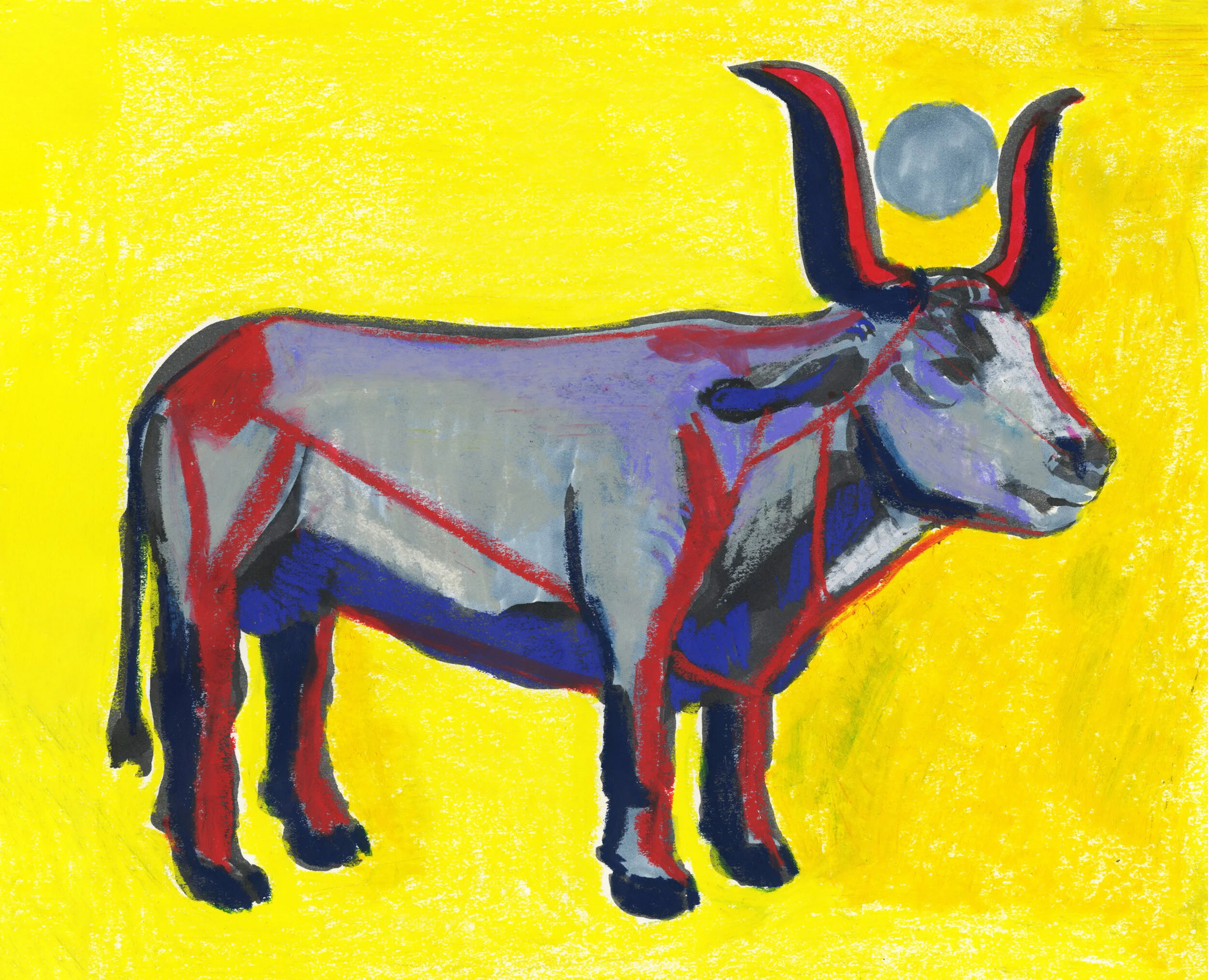
By the time I got here, I had a more ox-like ox. But once I did this more literal ox, it really bored me! Of course, I don’t think anyone can draw a bull (or an ox in this case) without thinking of Picasso, or at least I can’t. I love his lithographic series exploring just how little information you need to convey the idea of an bull. I didn’t look at it because I didn’t want to copy it, but it lives in my head, so I knew it would come out if I was thinking about what was essential for me. I had done some reading on the ox: obviously he’s an enormous beast of burden which symbolically you might think of as “male,” but his role as an animal that is put into service so all his strength benefits others gives him a “female” aspect. This and the fact the they are often castrated! In Egypt, the bull is associated with the sun and depicted with a golden disk between its horns. But I thought since we are celebrating a lunar new year, and given the ox’s female association, I would make it a moon. Sorry, Hathor!

Once I started playing with these drawings in the design I made, the design also seemed very boring. Words on top, Ox on the bottom, yawn! It all seemed so expected. I liked the moon and I thought it would be pretty to have it printed with a silver foil detail. But still boring! What about that moon, I thought? Wouldn’t it be pulling on everything? I mean, it moves ALL THE WATER IN THE OCEAN! So I thought it would make sense if the moon were pulling the words towards it, and it would break up the very static design.

Imagine that moon is shiny foil, or send me your address and see for yourself!
The Year of the (Pizza) Rat
Happy Year of the Rat, everyone! Does anyone still blog anymore? I guess as long as Smitten Kitchen and David Lebovitz are still at it, I should put this up and think about posting a little more often [insert thinky-face emoji here]. I thought I would use this blog post to take you through how I made my annual Lunar New Year postcard.

2020 is the year of the metal rat. I don’t know what you think of when you hear the words “metal rat,” but I am reminded of the rats on the portico of the Graybar entrance to the Art Deco-inflected Grand Central Terminal. In that case, they symbolize the importance of New York as a hub of maritime trade. For me, it was enough that rats brought an association to Art Deco. Once I had a direction, I spent some time looking through this lovely book that my brother got me for Christmas for inspiration.

It shows how the Art Deco philosophy and sensibility spread through the design of the built world and applied and fine arts. I started drawing some thumbnails that married this aesthetic with the things I knew I wanted in the card: rats, gears, forms for 2020, along with Art Deco design motifs. Since this phase is about working out ideas, I try not to worry too much about getting anything “perfect” or “right.” I think of it as playtime to let me hand wander with some references in mind. Already, you can see I had a pretty entrenched color palette, for no other reason other than it’s one that I like. Gold/yellow/pink 4eva.

After going a little crazy with gears and thunderbolts and flower motifs, I decided to pare it way down to that design from the second thumbnail in the last image. After all, I wasn’t covering a building—just making a 4”x6” postcard! I painted the elements in gouache, and put them together in photoshop. I found a font that wasn’t too pricey and voilá, sent it off to Moo to be printed.
After I posted it on Instagram, I had a conversation with a friend in the comments that sparked another idea. What if i combined this concept with the Pizza Rat meme? You remember that little rat with the big appetite from 2015, right? You must because the video has been viewed over 11 million times! That exchange resulted in a new round of thumbnails and designs.

Since the end product wouldn’t be a postcard, but an instagram post, I rethought the design for a square format. Should I show the whole pizza? How much did the space have to scream “subway?” I definitely wanted to keep the rat (of course!) and the 2020, and the text (with modifications), but I decided I should just add a slice of pizza (pepperoni, in a slight change from the OG Pizza Rat), with just a suggestion of subway stairs. I experimented with a different color palette in my thumbnails, but eventually settled on expanding it to a reddish orange for the pepperoni and the crust, and bit of purple to make the rat sit on the subway stairs a little more firmly.

Now that you know what my card looked like, what does this year look like? The year of the rat is supposed to keep everyone busy busy busy! If the past couple of weeks is any indication, then that forecast is one hundred percent correct! I guess we’ll sleep in 2021, when it’s the year of the Ox!
The Year of the Pig
2019 is the very auspicious year of the Golden Pig in the Lunar calendar. It’s always a fun challenge as an illustrator to put together a card to go out for the Lunar New Year. Each year comes with a color, and a set of associations that make it fun to work with. In this case, pigs are supposed to be symbols of good fortune and wealth because they have large litters. All those little piglets mean abundance!
I made a print with a couple of pigs, one more naturalistic , the other a bit stylized. I did them in red since that’s always a good color for the Lunar New Year. I knew I would probably change the color to gold to fit with the year, but it’s always good to have different color options.

I decided I like the more naturalistic pig better. I only did them on top of each other because of the shape of the linoleum that I had, but I ended up liking the placement of one pig on top of the other so much that I decided to keep it for the final card. After all, two pigs have got to be better then one, right? I went back and did the type on a separate linoleum so I could have more control putting it altogether in photoshop. And here’s the final!

If you want to learn more about how your sign will do with all this pig energy, check out this lady’s video. Gung hay fat choy!
The Piano Teacher
These covers are real outliers for me. It’s not that I shy away from reading dark stories or subject matters, but I don’t often feel like I want to explore them by making covers for them. I saw this movie and subsequently read the book years ago, but it’s always stayed with me: a story of violence and obsession, of how brutality is passed down like a disease first from mother to daughter, and then from lover to lover, how quickly a perpetrator can become a victim, and how quickly our sympathies as viewers can curdle and revolt. Is it any wonder I haven’t wanted to watch it or read it again?! But still, it stayed on my mind as a cover, so here are the two approaches.
I think any distortion or violence done to the image of a body is very disturbing on an intuitive, gut level. I really dislike the fingers separated from the hand. There’s something almost sensuous about the bruise in the other, which is gross. Gross! And that color all over the rest of the cover makes it feel like the whole book is covered in skin, EW! I’ve grossed myself out so much doing these covers, that I feel like I’ve really conveyed my experience of reading the book.
Both covers focus on the main character’s sadomasochistic tendencies. I mean, you should know what you’re getting into when you pick up this book, right? Erika Kohut holds a position at a prestigious Viennese conservatory where she teaches the most elite and talented of students. For me, part of the fascination of the movie was watching the teacher bully her students into submission, and thinking about how playing an instrument at that level is often a case of a “punishing” practice schedule, a curbing and subduing of students so that they can attain a competitive level of mastery. Erika’s harsh treatment of her students isn’t even that remarkable in this environment; it’s the perfect cover from under which she can freely indulge her cruelty. I wanted to make explicit the link between the instrument and her need to punish herself and to punish others. Do I have to tell you that things go from bad to worse over the course of the movie? I don’t want to go too much into it, so here are the full covers, and a variation on #2.
I gave you more context for the bruise in this one. Because the other one wasn’t gross enough?
A Separation
A couple of months ago I read Katie Kitamura’s novel A Separation. I was impressed with Kitamura’s writing, and the way she wove her themes of absence and death, searching and frustration. I liked it so much, I decided to try to make a book cover for it.
Kitamura’s story is told by a female narrator, who is detached and opaque throughout. She and her husband have separated, although they’ve largely kept that fact to themselves. Her mother-in-law, unaware of their separation, asks the narrator to travel to Greece to locate her now-missing husband. She does so and finds a smoking, ruined landscape, destroyed by a fire a few months previous. Her husband is a ghostly presence, seemingly just out of reach. She always just misses him. I won’t say anything more (spoilers!), but I was intrigued by the images Kitamura described, of the blue, blue waters and the black, still-smoking hills, and of the husband’s ghostly presence.
The first one I did focused on Kitamura’s unforgettable Grecian landscape.

But that didn’t seem quite right. While it got the setting, I couldn’t get a sense of the dislocation and distance of the narrator: her strange, clinical detachment. I wanted a little…more. So I made one of the narrator. Kitamura made her a frustrating one, telling a story and then negating or qualifying in the next paragraph. She withholds, and is always turning away from other characters as well as her own feelings. I thought if she were on the cover, it should show her back, turned away, or even walking away, anything to avoid a confrontation.

But once I’d done that, I missed that sense of place, that ruined, smoky landscape. So I brought it back in combination with that frustrating narrator. I decided to focus on that ghostly husband. But once I’d done that, I was annoyed. Here was a story told by a woman, why was I erasing her to feature a man’s silhouette on the cover? She was, in her way, almost as absent as the husband. In the end, I think I like them as a set: equally missing from their own story.

Have you read the book? What do you think would make a good cover?
Romeo and Juliet
I enjoyed working on my last Shakespeare book cover so much, I decided to keep on with another cover idea that I've been kicking around for a long time, but never completed: Romeo and Juliet.
I saw the play again this past summer in the park with my friend and fellow illustrator, Julia Sverchuk. She is a big supporter of the New York Classical Theatre, and always does a beautiful job drawing their performances on location. They put on the play outside in the park with characteristic verve. What struck me about the play was for all Romeo and Juliet talked about love, they BARELY KNEW EACH OTHER! And when I came home rolling my eyes about hormonal teenagers, Greg reminded me that it didn't matter. They were fated to fall in love, and fated to die (I hope I'm not spoiling it for you guys).
And when I read back into one of my medieval art books that in the setting of the play, I found that in 14th century Verona (and even in 16th century England, when it was written), the prevailing belief was that your destiny really was written in the stars (hence "star-crossed"). Nothing happened that wasn't fated already. So that's why Romeo and Juliet are tiny, tiny figures in my book cover, whose lives are lived out under the spinning, cosmic arbiters of their fates. They're also small to bring home how their lives are determined by the enmity of their families, who have divided Verona into two factions, and can only see in a limited palette of black and white. If Romeo and Juliet is not as much about the power of romantic love as much as fate, I think Shakespeare is making a case for civic unity as the foundation of any personal joy. The fomenters of disunity endanger their own loved ones in their feud, as the Capulets and Montagues learn to their heartbreak.
Tiny, tiny pawns of fate.
Thinking about the type, I found this beautiful book of prints from woodcuts and engraved plates first published in 1601 in Nuremberg by Paul Franck. There are several alphabets in the book, each more swirly and mind-blowing than the last!

Look at this crazy, swirly type!
Their whorls and swirls reminded me of the witty wordplay (and perhaps swordplay) of Mercutio and even Romeo himself. I thought I could take these elaborate letterforms and soften them for a more hand drawn (and romantic) feeling, while keeping a (loose) reference to the Renaissance timeframe of the play's creation. The type allowed me to introduce some of that romance back into the cover since I suppose, against all reason, that we will continue to think (and market) Romeo and Juliet as "romantic!"
Othello
I made this illustration a few years ago, but never managed to put it together into a book cover or poster. Sometimes it can be hard for me to marry something I've drawn with type. Maybe I'm too close to it, but I often feel the cold, vector lines of a font just don't gel with my clearly hand-drawn illustrations. When I saw that The Public Theater is putting on Othello this season at Shakespeare in the Park, I thought I would dig it up and give it another try.

Book cover on the left, poster on the right. But you knew that already.
Of course, my answer was very simple: trace the font by hand so its sharp edges won't contrast against my drawn edges. Why didn't I think of that before? Since Othello takes place in Venice, and the original on which Shakespeare based his play is from the mid 1500's, I chose Mantinia for the font because it was based on the letterforms of Andrea Mantegna, an artist of the Italian Renaissance. It doesn't hurt that it's exquisite and has enough personality to hold its own with a minimalist illustration.
For the illustration, I took the idea of a classical bust since Othello is described as noble, and is fêted for his military successes. The important change being that Othello is, of course, a Moor. By and large, most of those classical portrait busts are of white men (I can only think of a few specific portrait busts of POC) and are carved in white marble, so drawing him this way highlights his difference. I used charcoal to draw his profile to emphasize that as well. I thought a minimalist approach, with the simple profile on a white ground, would highlight it even more. When Iago schemes against Othello, he says that he will "pour this pestilence into his ear," so the ear was already a feature that I knew would be important. To imagine Iago, or perhaps his innuendo, as a snake, and then to make the snake into Othello's ear was a quick visual jump.
I learned a lot doing this—mainly to never throw out something I think I'll never finish!
The Year of the Dog
2018 is the Year of the Dog in the Lunar Calendar, and I am so ready to turn the page on the Year of the Rooster. I was a little too exhausted and overwhelmed this past holiday season to send out holiday cards like I usually do. I just couldn't get into the holiday spirit. So I promised myself I wouldn't let the Lunar New Year go by without sending out some cards to my friends.
I started out doodling some dogs on a old throwaway piece of 18x24 paper because I thought it would make me happy to draw them kind of big, on paper I didn't care about, just for fun. I didn't really mean for it to become anything that I would send out or show anyone. If anything, I thought they would be practice dogs for a *real* piece that would come later. And then I let some of them be really silly and derpy because that's why we love them, right? They get so excited, jumping around, and they just can't hide that they love you, they love rolling in the dirt, and running fast. They love the world. I put in the words in any spaces that didn't have dogs, and decided they wouldn't be fancy script, but just straight-forward all caps. It seemed to suit the dogs I had drawn the best. I patched a few places where the ink had run or dripped, and then used up a whole marker (ha!) making them a yellow field to play in. By then, I had fallen a little in love with how silly they were, and I didn't want to draw them more accurately or "better." I felt it would take away some of their joy.
The rest of the story is Photoshop and Moo. By now, most of the people I've sent them to have received them. My friend Alex was kind enough to share on his Instagram, so you can see the finished postcard here. I still have a couple left, so if you didn't get one, leave me a comment or send me an email with your address and I'll send one to you!
People born in the Year of the Dog are supposed to have something of the dog's friendly, generous spirit, with a deep sense of right and wrong. Those traits are supposed to carry over to characterize the year, with people fighting for causes they believe in, according to one site I read. Happy Year of the Dog, everyone! May you have health, wealth, and prosperity in 2018!
Artists for Democracy on the AOI Blog
The Association of Illustrators recently featured #ArtistsforDemocracy in a blogpost entitled "Understanding Each Other Better," and it has me taking a look back on 2017. It's hard to believe it's been a year since we got on that bus to Washington DC for the first Women's March, and honestly, it's a little painful to reflect back on the year. There just doesn't seem to be a bottom to this unscrupulous, unprincipled, cruel administration.
But drawing—and specifically drawing on location—has remained a bright spot. It takes me away from the steady drip of bad news, and connects me up with the people who feel the way I do: the angry, exuberant, hopeful people. Even better, it's great to go out and draw with the amazing artists I am lucky enough to call friends. Go take a look at the Artists for Democracy instagram and you'll see what I mean. I'm looking forward to drawing at tomorrow's 2018 Women's March. If you're in New York City, maybe I'll see you there!
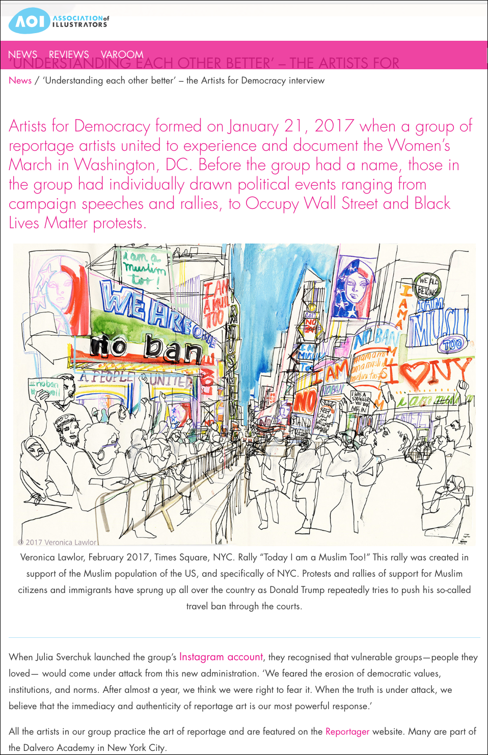
A big thank you to the AOI for featuring us!
This Is What America Looks Like!
It's been a busy few weeks since Inauguration Day. Every week brings a barrage of consternating news, and then a protest in reaction. From the Women's March, to the anti-Muslim Ban protests, to Resist Trump Tuesday, to a protest in support of the LGBTQ community, every week offers opportunities to voice our dissent.
This is from the Women's March. Unfortunately I was feeling a bit under the weather—which turned out to be flu later!
I was completely astounded by the size of the Women's March. I was apprehensive that it would be a one-off and then everyone would go back home and move on with their lives. "Oh well, we protested that one time, and it didn't do anything." But the opposite has happened. As the weeks go on, I continue to be impressed by the number of people who come to stand in the cold on a Saturday afternoon, but also the diversity of people and the diversity of issues that they care about. At the Women's March, there were people chanting that black lives matter. At the LGBTQ protest, there were signs in support of Muslim and refugee rights. This is heartening to see. The only way a resurgence of the left will work is if we are all here for each other.
At JFK Airport the evening the Muslim Ban Executive Order was announced.
At Battery Park in late January. The Muslim Ban was especially reviled here in New York. As a city made up of immigrants of every stripe, we took the ban personally.
Going to a protest is a great way to be invigorated and to take heart from other people that share your concerns. It's hard to feel scared and alone when you're chanting " No hate! No fear! Refugees are welcome here!" with a few thousand other people.
Also, it's fun! There are clever signs and people drumming and dancing and playing music. The LGBTQ protest was the best for fun signs. (Please note the sign that says "Never underestimate the power of a faggot with a tambourine.") The gay community is a politically active one that is not new to protesting, and it shows.
For a week or two, I worried that all the protesting, while making me feel better, was just a sop to my feelings and was completely ineffectual outside my liberal New York bubble. But it seems that the protests have gained some traction, forcing the administration to walk back some of its crazier overreaches, hopefully giving comfort to the people that have been targeted by these Executive Orders, and putting our representatives on notice that we are paying attention. I hope that people stay engaged, reach out to others, and organize. We need to get in formation and then we need to VOTE!
I think my favorite chant was "Show me what America looks like! This is what America looks like!"
The Year of the Rooster
Happy Lunar New Year! When this website told me that the 2016 (the Year of the Monkey) was going to be the "wizard of the impossible" last year, little did I know how true that would turn out to be. I don't remember a year when every piece of conventional wisdom was turned on its head. This year, I am ready for the Rooster when it says "I am alert/ ready to take action" because that's exactly how I feel. "Never give up or in," the Rooster says. If these first few days of the new administration are anything to go by, we have a long, hard road ahead of us in the next four years, and I, for one, am taking the Rooster's advice.
My Last of 2016
My friend Evan Turk reminded me via his blog post the other day that we went to the Central Park together a few months back, when it was only slightly chilly and the leaves were still on the trees. Thanks Evan!
Austin Throwback Thursday
It's a cold winter's day here in New York, but I'm casting my memory back to a warm, lazy October day in Austin at Barton Pool with Julia Sverchuk and April Kelly.
Life Drawing Again, Life Drawing Always, Part II →
Here are the rest of my drawings from the second day of Dalvero Academy's weekend workshop.
First we had Erica, whose energy is poised, but so relaxed.
And then we had Magda, who feels like a coiled spring, even in a tutu.
Life Drawing Again, and Always, Pt. 1
"I believe that in the indeterminacy of drawing—the contingent way that images arrive in the work—lies some kind of model of how we live our lives. The activity of drawing is a way of trying to understand who we are and how we operate in the world." —William Kentridge
Read MoreChinatown Volleyball
During the summer and fall, the park downstairs from my house hosts a lot of volleyball games and tournaments. The teams are made up of local middle and high schoolers, and are co ed. They'll spend the whole day playing and cheering each other on, practicing their digging and their setting on the sidewalks of the park. I thought I would play around with watercolors, but after a few disasters, I packed up my bag and came home. I pulled it out a few weeks later and, thinking back to that day, added in the black ink to define the court and the trees, and the buildings from across the street. Finally, I made a few (tiny) volleyball players and collaged them in. Another good reminder that just because it didn't work out on location doesn't mean you can't salvage it at home!
Debate Night
Monday night, I watched the Presidential Debate between Donald Trump and Hillary Clinton. At first, it seemed like we'd see a different Trump than the "tangerine trash can fire" that won the primaries. He sounded like maybe he had an argument about trade, rather than the word salad strewn with casual lies he usually employs when speaking publicly. For a second, I thought, maybe he did prepare, and I got a smidgen worried. Not for Hillary exactly, because she's had a lot of debate experience, but for America. I thought if he could make himself sound halfway plausible, he might be able to reach some voters that have so far been undecided.
Trump sounding halfway plausible for two seconds.
But then, as the debate went on, and Clinton needled him on some of his past comments, the old Trump emerged, the one who can't let anything pass, the one who keeps smearing people even after it'd be to his advantage to move on. He melted down like a CheezWhiz volcano, and Hillary Clinton got to look at America like the cat that got the cream.
Nevermind, CheezWhiz volcano in full effect.
You may not love our choices, but if you have to cross a chasm, do you go with the bridge that you don't totally trust, or do you just throw yourself off the precipice? The thing that makes me really sad is that even after this election, after Hillary wins (I really hope she wins), Trump and the ugliness he's brought out in our national discourse won't go away. He's legitimized conspiracy theorists, white supremacists, and alt right nuts and made a place for them in the mainstream conversation.
Whatever you think, please do register today, and VOTE on November 8th.
Bryant Park Birthday
I celebrated my birthday last week, and what better way to celebrate than to go out drawing with a friend? Evan Turk and I had a beautiful fall-like day, sunny and bright at Bryant Park. It's a great place to draw because it's a perfect mix of people, greenery, and buildings, and it even has a beautiful fountain and a mini-carousel. That day, I wanted to draw the fountain, and the people taking a little time out of the bustling midtown afternoon to enjoy the sound of the water and the breeze.
August Conversation
I went out to the Hudson River Park the other day with some friends, and it was that most unusual (for New York) of occurrences: a beautiful August day. I'm not really a big fan of summer—the HEAT!—but on an 85 degree day, watching people sunbathe and enjoy the breeze coming off the Hudson, I could see the appeal.